Workspaces
Visualizations
Datasets
Basemaps
Profile
Maps
Creating Maps
Maps can be created by clicking Insert in the Toolbar and then dragging a new map onto the canvas. You can also click the map icon in any empty section.
Click on any map on the canvas to select it. Like other elements, maps are highlighted in blue under the Layers tab once they have been selected.
Once selected, a map can be customized by selecting the Map tab on the right of the page, where the following functionality is available:
Setup
In the Setup section, you can assign the map the following properties:
- The name that will be used to reference it in the Layers tab and on the canvas.
- The top, right, bottom, and left Margin that will be added between the map and the edge of its container.
- The Size Ratio of the map container. Since the map will always take up the available width inside its parent section, the size ratio effectively determines the map's height.
- Optionally, the map's Minimum Height and/or Maximum Height. If the height calculated by the size ratio is smaller than the Minimum Height or larger than the Maximum Height, then the Minimum Height or Maximum Height is used instead of the size ratio.
Map Types
Mappica supports the following map types:
Arrow Maps
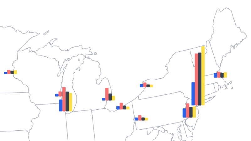
Bar Maps
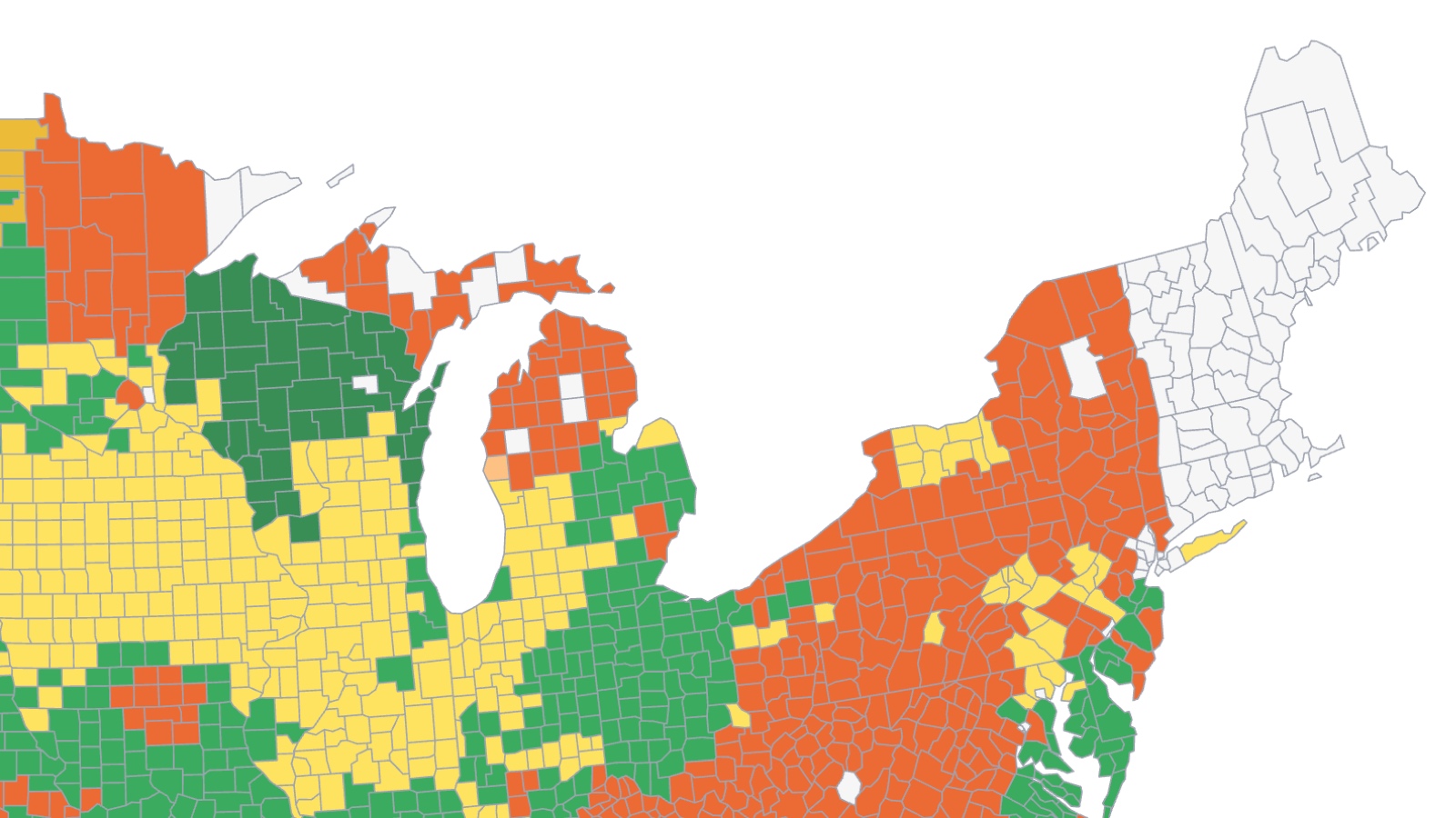
Choropleth Maps
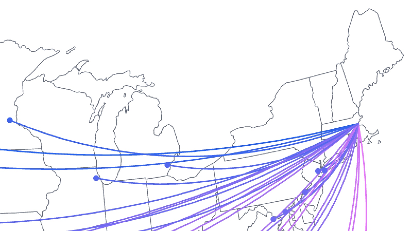
Flow Maps
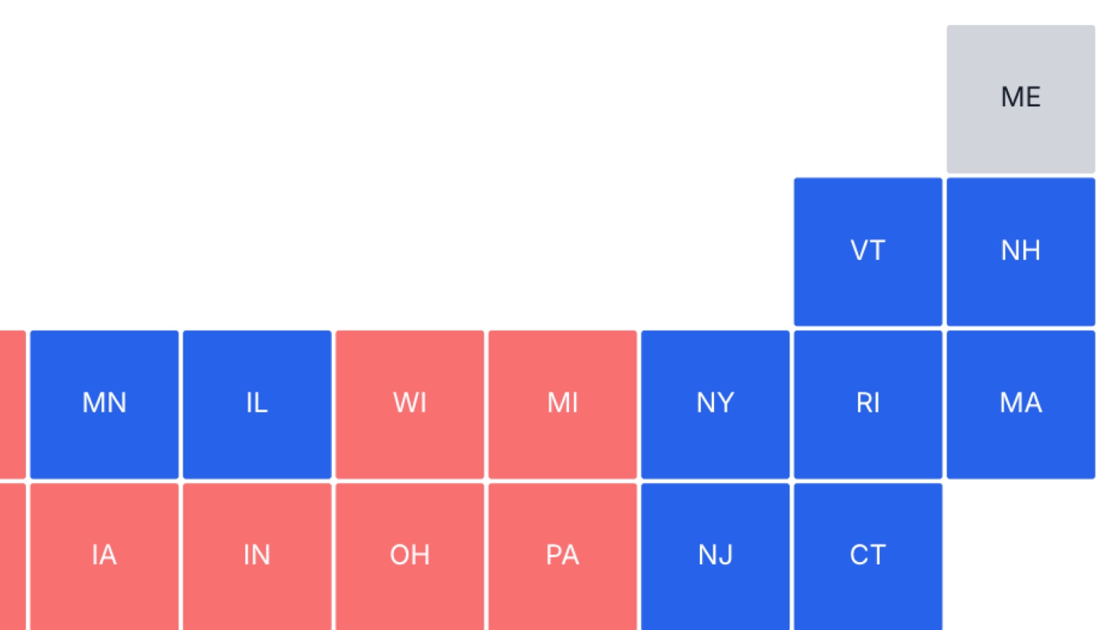
Grid Maps
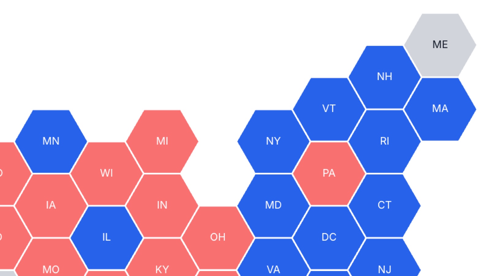
Hex Maps
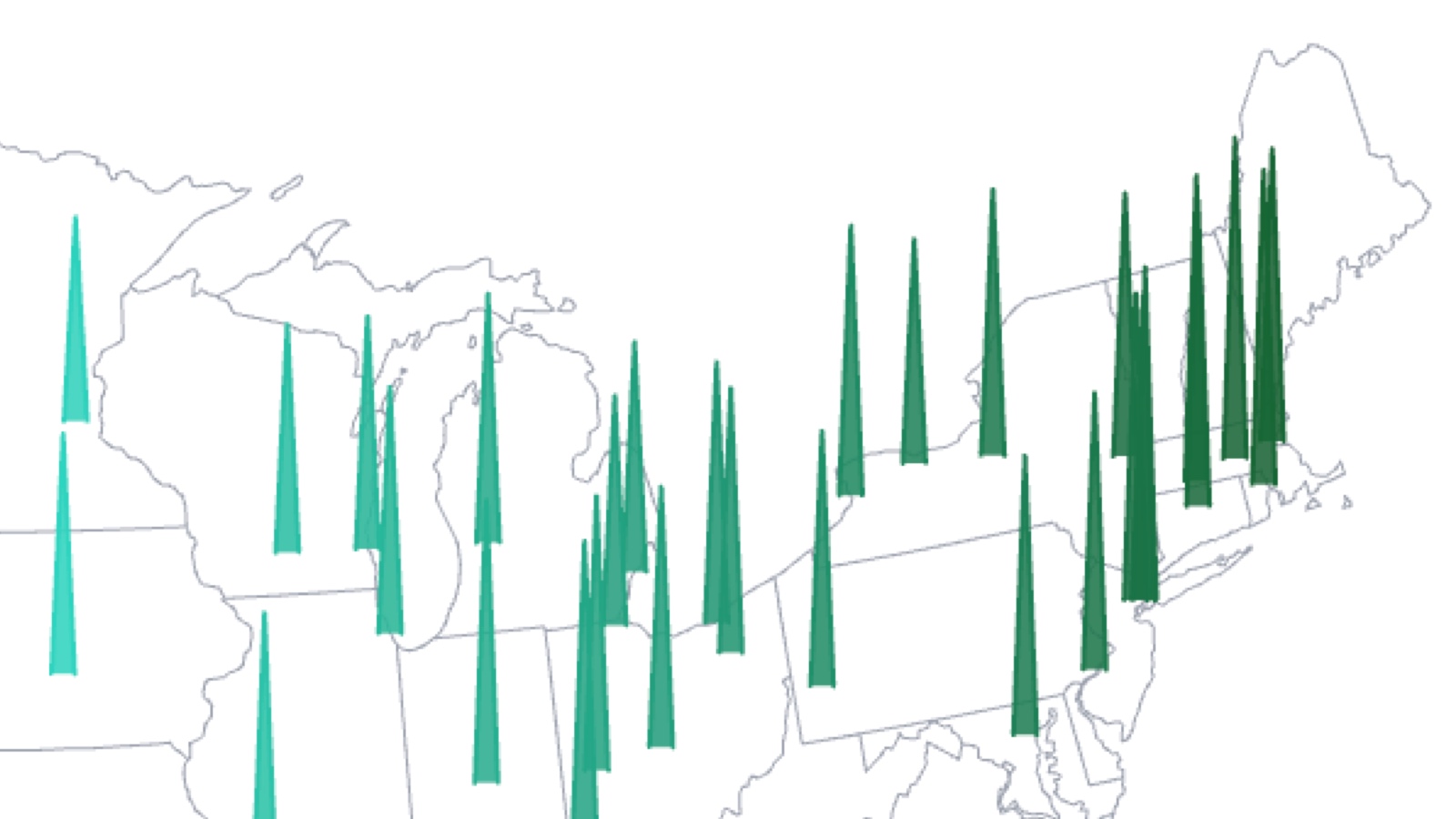
Spike Maps
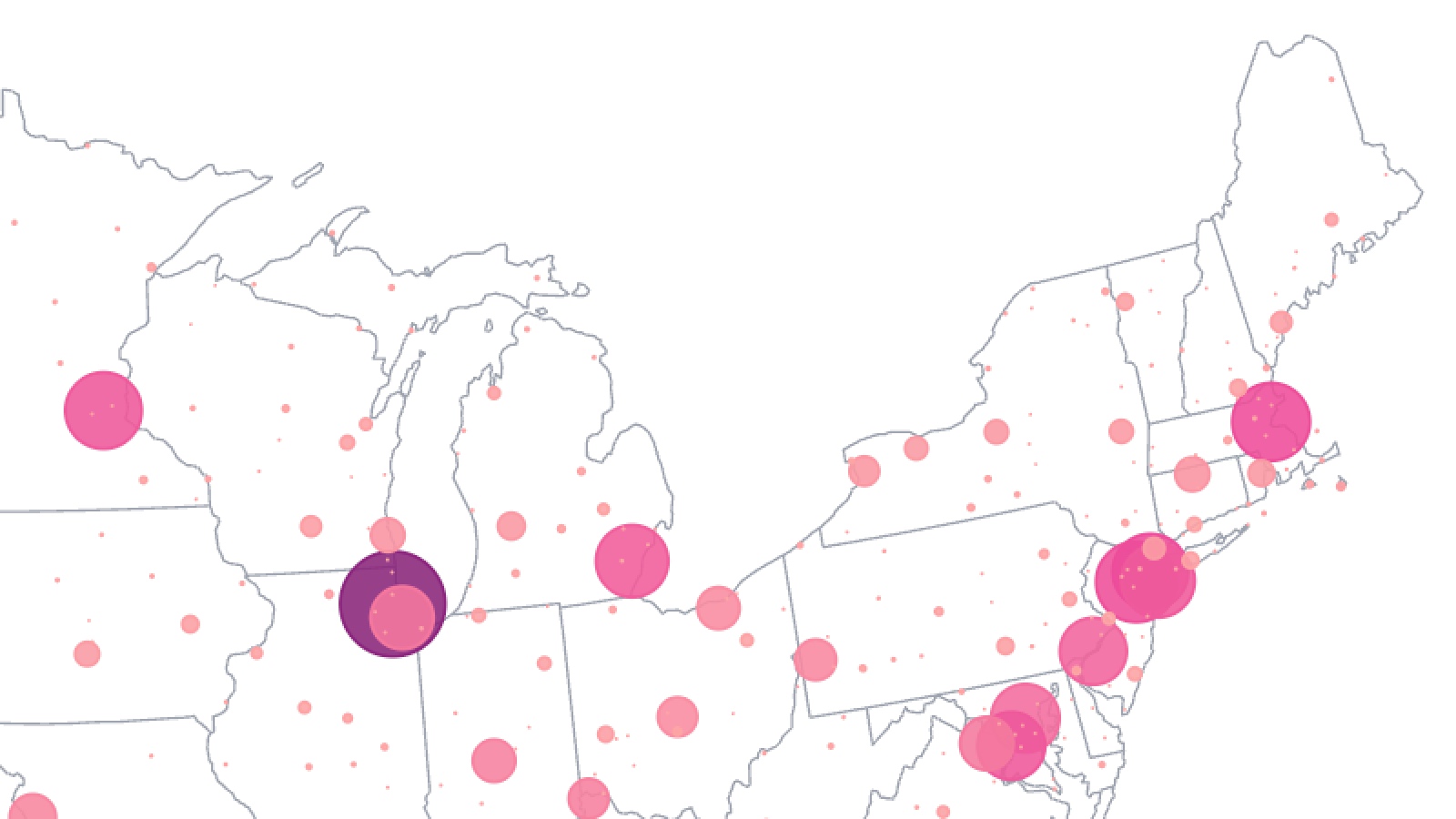
Symbol Maps
Connecting to a Basemap
In the Basemap section, you can select an underlying basemap for your map element. The basemap is a map, stored in GeoJSON format, containing a variety of geographic features, including polygons, points, and lines. These features can represent areas like countries and provinces, as well as locations like cities and landmarks. In order to add a basemap to a map element, you must first add a basemap to your project. This can be done by selecting New Basemap in the Project tab and selecting Find Basemap, which opens a library of more than 600 basemaps to choose from. You can also browse our basemap library to explore available options before adding them to your project.
If you are on the Pro plan, you can upload your own files (in GeoJSON format) to use as basemaps, by clicking New Basemap, then Upload Basemap.
If you are building a Choropleth map, you also need to select a Basemap Join Field. This is a field in your basemap with unique values (e.g. IDs or names) that will be used to link the basemap to the dataset. Values in this field should match values in the Dataset Join Field.
If you're unsure which field to use as the Basemap Join Field, open the selected basemap by navigating to the Project tab and scrolling to Basemaps. Select a feature (geographic shape) on the map, and the Feature tab will display the fields and their corresponding values for the selected feature.
Bar maps, spike maps, and symbol maps do not need to be joined to datasets because the location of the bars, spikes, or symbols is determined by the dataset latitude and longitude fields. With these map types, the basemap is not connected to the data and is simply a background layer. The basemap also determines the visible area in the map container, so any data points with latitude and longitude values outside that area will not be displayed.
Connecting to Datasets
In the Dataset section, you can select the dataset for your map element, which contains the data that you wish to display on the map. In order to add a dataset to a map element, you must first add a dataset to your project. This can be done by selecting New Dataset in the Project tab.
If you are on the Pro plan, you can upload your own files (in csv format) to use as datasets, by clicking New Dataset and then Upload Dataset.
After you have selected a dataset, you can optionally enable the Prefilter Dataset switch, which lets you filter the data that is supplied to the map. The filter is a "prefilter" because it is applied before the visualization is generated; end users are unable to adjust the filter dynamically.
If you are creating a Choropleth map, you need to select a Dataset Join Field. This is the dataset field that will be used to link the dataset to the basemap, so it needs to contain values (e.g. IDs or names) that match with values in the Basemap Join Field.
To quickly create a dataset that can be joined to a basemap in your project, open the Project tab, select New Dataset, then New Dataset from Basemap. You can then pick which basemap fields to store in the new dataset, including the field containing unique values that you will use as your join field.
If you are creating a bar map, spike map, or a symbol map, you will need to select Latitude and Longitude fields. These are fields (columns) within the selected dataset that will determine the location of each bar, spike, or symbol record on the map element. Both fields must be assigned the Coordinate data type in the dataset editor.
Connecting to Filters
You can establish connections to filter elements under the Map tab, in the Connections section, by making a selection under Filter.
Filter elements display values from a specified Filter Field, in the form of checkboxes, dropdown menu items, or (for numeric filtering) slider values. A given map can be connected to one or more filters, and the same filter can be connected to multiple maps or other elements. Once connected to a map, a filter element will dynamically control the dataset records passed to the map element, based on user selections made on the filter.
Typically, the filter element you connect to will use the same Dataset as the map element. However, this is not strictly necessary. If the filter and map elements use different datasets, the filter will only affect the map if the map's dataset contains a field (column) with the same name as the Filter Field in the filter element. In this case, the values in these fields must at least partially align for the filter to take effect. Any non-matching values between the fields will be ignored during filtering.
Connecting to Selectors
If you are building a bar map, you can establish a connection to a selector element under the Map tab, in the Connections section, by making a selection under Selector.
Selector elements control which series fields are displayed in connected elements that use a wide data format. Among map types, only bar maps display series fields using a wide data format, making them the only map type that can be connected to a selector. Selectors can be displayed as checkboxes, dropdowns, or legends. While a map can be connected to only one selector, a single selector can be connected to multiple maps or other elements that use series fields. Once connected, the selector element dynamically controls the dataset fields (columns) passed to the map as series fields based on user selections.
Colors
Color formatting, defined in the Colors section under the Map tab, is specific to the selected map type:
Bar Maps display series data, allowing you to assign a color to each series field. You can also optionally adjust the bar opacity.
Choropleth Maps, Symbol Maps, and Spike Maps let you assign a Color Field, which can be used to choose a text field or numeric field (number, currency, percent, or measurement) from the selected dataset. If you select a text field, each unique value in that field will be treated as a category and can be assigned a color. For numeric fields, you can configure a Color Gradient, Domain Minimum and Maximum, and Color Scale. You can additionally assign a Missing Data Color and alter the default color Opacity. These features are explored in greater detail in our Colors page.
Spike Maps and Symbol Maps also let you assign a fixed color to all spikes or symbols on the map. This is useful when you only want to vary the spike height or symbol size while keeping the color consistent.
Bars, Spikes, and Symbols
Bar, spike, and symbol maps follow a similar structure, allowing you to adjust key properties related to their size and appearance:
- Field Assignments: You can set the Spike Height field to control the height of spikes in spike maps and the Symbol Size field to control the size of symbols in symbol maps. In bar maps, the height of bars is controlled by values in each Series Field, which are set in the Dataset section.
- Maximum Size/Height: Each map type has fields to set a maximum size or height. For bar maps, this is the Maximum Bar Height; for spike maps, the Maximum Spike Height; and for symbol maps, the Maximum Symbol Size. These fields control the size of the bar, spike or symbol when the data value reaches a second defined field, Maximum Bar/Spike/Symbol Value. All other data values are scaled proportionally.
- Dynamic and Fixed Options: For symbol maps, you can choose to have a uniform size for all symbols on the map (fixed) or scale the symbols based on data values (dynamic). You can choose fixed if you only want to vary the symbol color while keeping the size consistent. In contrast, bars and spikes always scale dynamically.
- Additional Customizations: Each map type also offers options such as bar or border width, along with customizable border colors, to further refine the map's appearance. These are detailed in the documentation pages for each map type.
Annotations
In the Annotations section under the Map tab, you can add annotations consisting of text and/or symbols to your map.
Begin by picking a longitude and latitude to place the annotation on the map. You can then choose either or both of the following two options:
- Add Text: Add some Text, pick a Color, and specify the Text Position in relation to the chosen longitude and latitude.
- Add Symbol: Choose a Symbol Shape, a Color for the symbol, and a fixed Width in pixels.
Tooltips
Tooltips on maps can be enabled by selecting the Map tab, navigating to the Tooltip section, and selecting Display Tooltip. These are automatically configured to display the series fields you have selected in your map.
In situations where the same field has been used more than once (for instance if you are using the same field to set both symbol size and color), the tooltip will only display information about the field once.
In choropleth maps, you can optionally set a Color Field Label, which defaults to the name of the Color Field if unset.